Andi (Owner, Creative Director, Epic Design) is an incredible talent, with vision, strategy, and creative execution. I first began working with Andi at the Vancouver Canucks and she was always one of my favourite graphic designers to work with on the team. She came to the table with fresh ideas and great vision. She has fantastic energy and a welcoming positive attitude. Andi has a great heart and she puts all of herself into every job she takes on – I could always count on her, from small every day jobs to large scope projects that took months to plan.
Vancouver Canucks Hockey
Andi Mortenson, Owner / Creative Director of Epic Design started her sport design career here as a Senior Designer, and continued with additional contract work through Epic Design since. Early on, she worked with the Creative Department to develop the new look and feel in switching over from the old logo with the maroon and blue colour schemes to the fresh new ‘VANCOUVER’ blue and grey logo and blue and green colours and stripes.
.
Challenge
With a refreshed logo and new colours, every piece of collateral connected to the club – internally and externally – had to be redesigned. This included dozens of sub-brands, team and fan events for games, and the Canucks for Kids Fund. This was followed by a company renaming to Canucks Sports & Entertainment, which meant a corporate rebranding and new signage throughout the entire building. As an additional challenge, our photo library of the players was essentially obsolete as we were only approved to use imagery with the new jerseys.
Solution
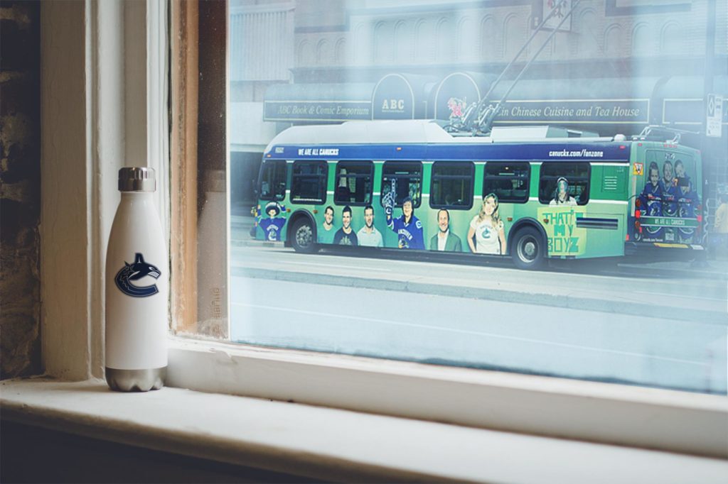
The team developed a clean & simple corporate ‘base’ brand to start our first season with the new colours to allow us to redevelop all of our new wordmarks and corporate collateral. This was based on a guaranteed new constant for the club: the new jersey stripes. The concept for our photography choices was the connection between the player & fan. We aimed to pair the youth and fan shots with behind the scenes shots of the players that would serve to tell a story. This is when we launched the slogan “We are all Canucks”. This was then executed on buses, skytrain platforms, season tickets, and all other types of collateral.
Results
The work our Creative Services team developed that season served to create a base that is still used today, and continues to grow from season to season. We clearly communicated our new slogan and successfully established the green & blue stripes as our ‘Nike swoosh’.

