Wrestling Canada Website & Brand Development
During the removal and reinstatement of wrestling from the Olympic Games, Wrestling Canada Lutte engaged Epic Design to modernize their identity, to better reflect both the future of the sport in Canada and the changes to the sport. We first developed the brand and website in 2014, and further developed the brand during the 2016 Rio Olympic Games. A fresh version of the site was just created and launched in 2018 with added functionality and updated technologies.
Website
Our team redesigned and relaunched the Wrestling Canada website in time for the Commonwealth Games. The new site better serves as a database of Canadian wrestling athletes and easily displays who is competing for which teams and for which events. Once an athlete becomes an alumni, they are tagged as an ‘alumni’ in the backend, and if desired, we could easily generate a page displaying all alumni’s. This is a function that could prove useful for many national sport organizations. We approached both Karate Canada and Wrestling at the same time as we knew they would have very similar needs. By developing both sites in tandem, we saved both clients development and design costs, and still completed everything within the given timelines.

Brand Development
Challenge
The new logo and look needed to simultaneously showcase the history and tradition of wrestling, while presenting a modern, clean look. The new brand also needed to resonate as a high performance national sport organization, invoking a feeling of pride for athletes and Canadians alike. Additionally, as a national body, all assets needed to be bilingual.
Solution
After researching both the sport of wrestling, and interviewing interested parties (athletes, coaches and alumni) we designed a logo and look to embody the new direction wrestling was taking, while giving a nod to the ancient traditions of the sport.
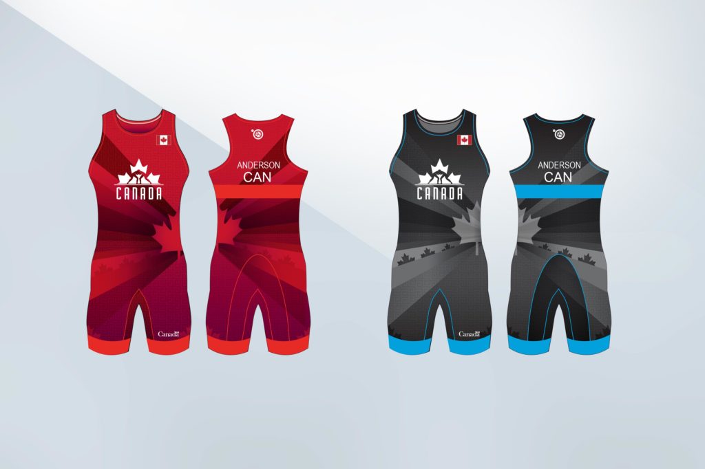
The logo, ‘Proudly Canadian,’ symbolizes the rebirth of the sport, or the rising of a new era, as the maple leaf resides above the text and illuminates the silhouettes of the wrestlers in front. With a modern edge to its simplicity, this logo evokes promise for the future, and a level of podium prominence that comes with being a top performer. Its use of negative space further adds modern detail, giving perspective and depth, making effective use of space and colour to ensure easy application to various surfaces or materials.
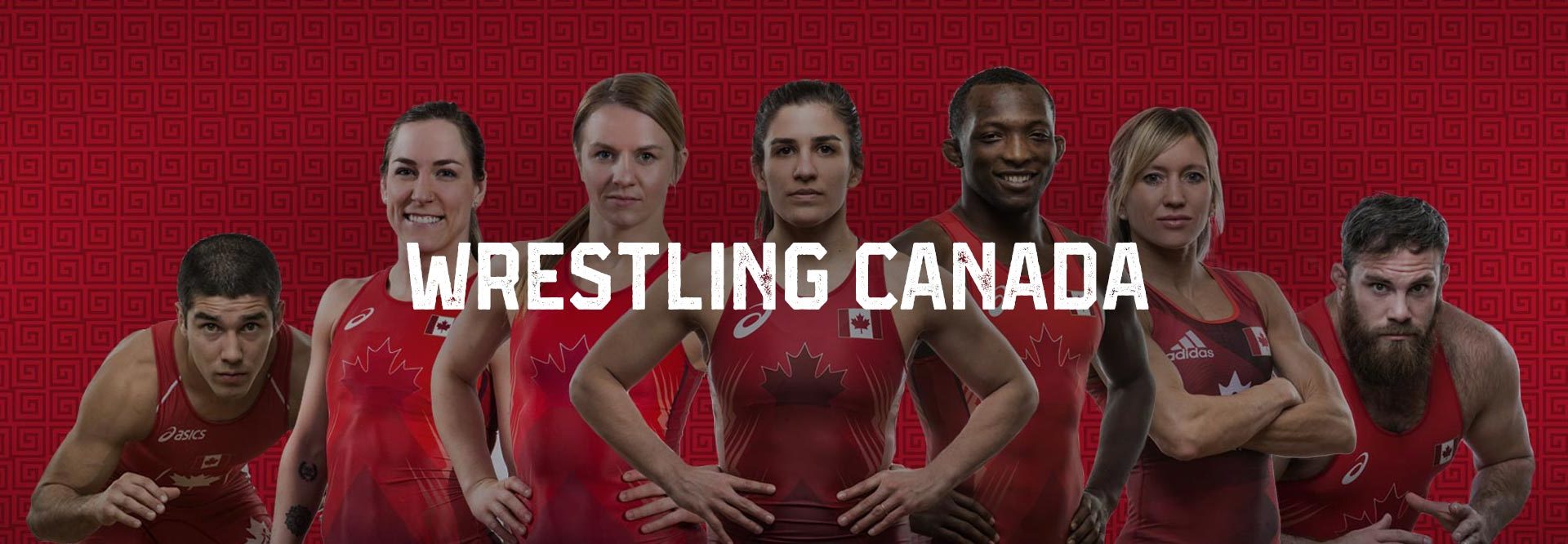
The brand look uses patterns from the ancient era, invoking the Grecian roots of the sport. The photography used was art directed by Andi Mortenson, to convey the intensity and physicality of the sport. By marrying the modern logo with the ancient patterns, we achieved a balance between the contrasting ideas.

Result
The new logo formed a solid foundation to develop many sub brands for Wrestling Canada Lutte, and the events their athletes are involved in. The brand is proudly worn on the competition singlets at Olympic and international events, and on merchandise and athlete warm-ups and uniforms. We continue to evolve the Canadian Wrestling brand in order to keep it fresh and relevant.
